Design for Delivery and Focus (Battle Systems)
|
This article has been transcribed from Yanfly Channel.
In battle systems, good information delivery can keep a player focused on the battle without diverting it too much. Battles move quickly, so it’s urgent that the delivery of information is precise as well. Poor delivery of information can divert a player’s focus. A player with a diverted focus will most likely be unsuccessful in battle, even if it may be an easy battle. Though the player may win that battle, the player may have taken unnecessary amounts of damage due to poor choices made independent of the player’s strategies. You do not want to punish players for reasons they do not deserve and that includes poor delivery of information. This article will show examples of how simple design changes can make a big difference on properly delivering information and keeping a player’s focus. While I do not advocate myself to be a know-it-all in regards to game design, I do believe that a lot of what I have to say contains logical choices for the designs I’ve used in my scripts.
The above example is what appears in RPG Maker VX Ace’s default battle system. While not a bad battle system at all, the delivery of information to the player relies on the log window above. This causes problems because the log window remains in one area while the target attacked is at a different location. Therefore, the player splits focus in order to acquire the information delivered. This causes problems if the player focus on one area and not the other. Information may be missed, which generally isn’t a good thing at all.
The above screenshot utilizes damage popups on top of the target attacked. The information delivered occurs all in one area and reduces the need for the player to focus in on other areas. Therefore, the player does not miss information and is not at a disadvantage. The popups were added using Ace Battle Engine to streamline the delivery of information to the player.
Although menus are more forgiving to the player if the player splits focus, I’ve often found myself that if the menus split my focus, I spend more time browsing them. And through spending more time browsing menus, I would tend to lose track of what I was going to do in battle. In the screenshot above, the default skill menu splits my focus between looking at both the top of the screen and the bottom. This will cause the player to split focus in order to see what amounts of MP or TP are needed for skills.
Using Ace Battle Engine, the skill window moves to the bottom of the screen right next to the actor with all the necessary resource information provided. This allows the player to keep focus in one region. It’s far easier and faster to compare the resources available to the resources needed, thus, reducing the amount of time needed to be spent browsing menus. And by reducing the amount of time browsing menus, the player maintains focus on battle. Granted, the design in the above screenshot isn’t perfect, but it’s still far more efficient than needing to split up the delivery of information from the top of the screen to the bottom of the screen. Why is that?
The design of a human eye acquires visual information faster horizontally than vertically. Split screen menus may not seem a whole lot different when compared top to bottom versus left to right in theory, but in practice, the player acquires information at a faster rate in this regard.
A major problem in the screenshot above is that when the skill window is opened up, it’s difficult to tell who is being attacked. Not only because the skill window obscures the battlefield’s view, but there’s no indication of which slime is Slime A and which slime is Slime E. This slows down the delivery of information to the player and with a lot of enemies, it’s quite difficult to figure out which enemy is which. No matter how much a player focuses on battle, it is extremely easy to lose track of which target is which.
With some simple indicators such as highlighting the enemy and placing an HP bar beneath the enemy, the naming of Slime G isn’t even necessary. Right away, the player will be able to tell which target will be attacked. This is done possible by 1) the skill window not obscuring the view of the battlefield, and 2) providing indicators to assist the player in figuring which is the selected target. The delivery of information is fast and the player’s focus is maintained using a combination of Ace Battle Engine and Enemy HP Bars.
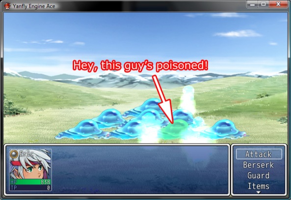
In the screenshot above, one of the slimes is poisoned. Can you tell who? No you can’t. Because there’s no indicators that the slime was poisoned. In the battle phase though, it’ll flash that Slime G is poisoned, but which one was Slime G again? There’s so many slimes and I’m almost positive you can’t even figure out what number the letter G is in the alphabet quick enough. The delivery of information here is practically nonexistent and the player’s focus may be diverted in trying to figure out which slime was the slime affected by poison.
However, this isn’t a problem when there are visual indicators. Using a repeating animation from State Animations, the poisoned Slime G has a visual indicator on it to let the player know that it’s poisoned. The delivery of information is fast and the player’s focus is maintained.
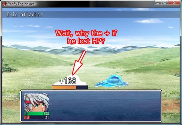
It’s in bad design to go against human train of thought. When dealing damage, while damage in code may be positive, to the player, the damage dealt would be negative to an enemy because it’s depleting the enemy’s HP. Using a + may be accurate in code but inaccurate to a player, and therefore, bad design. While the delivery of information may be delivered quickly here in this screenshot, it will also divert a player’s focus as the player may have to wonder why it’s a + when the enemy is clearly losing HP.
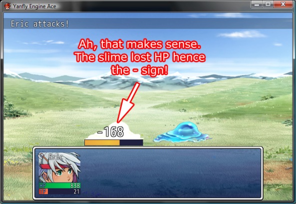
And so, the damage dealt in this screenshot will show a negative. Sure, in code, damage isn’t negative unless it’s for healing, but that’s not the case for players at all. The information delivered to the player here goes along the lines of “Hey, this slime lost 168 points of HP” rather than “Hey, this slime gained +168 damage”. The delivery of information remains at the same speed as the screenshot before it, but the “accuracy” and intuitive design of the delivery helps the player maintain focus. These are mostly some small changes that make big differences. Should you choose to alter your game’s design through either a person’s scripts or even your own, take these designs into consideration. While they’re not perfect, they remain quick and efficient in the delivery of information to the player. With quick and efficient delivery of information, the player maintains focus in a quick battle. The more successful a player is in keeping focus, the more likely the player will be successful in battle. And successful players will be happy players. |